I rebuilt this site from scratch. Not the content, there was barely any, but everything around it: the colours, the type, the little marks in the margins, the CMS solution. This is a tour of how it came together, and of what I was looking at while it did.
North star(t)
With any project you need to decide where to start. I have a whole posture on what's the best way to engage in any creative endeavor which is centered around iteration and exploration. So in order to know what I wanted my site to look like I used three things as initial anchors:
- I want to share more of me with the world. Similar to how Simon Willison does through his blog.
- I really love the color and texture from off-white paper and I also love retro-tech.
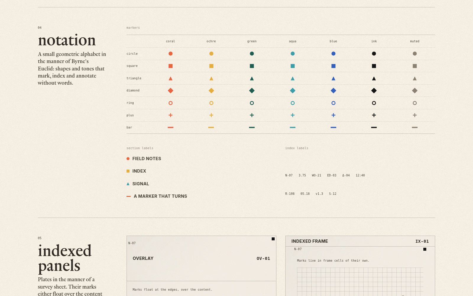
- I've always loved the idea and aesthetic of Oliver Byrne's Euclid.
Those were my initial wants. So I started my iteration by chasing solutions for these.
The juice
I like it when things look pretty, in their place and intentional. To be fair, I also find things that would seem opposite to the above to be quite beautiful as well. A simple example is that I thoroughly enjoy a mess which happens to be in place and beautiful. Point being, I enjoy aesthetics so that's the first thing I tried to explore.
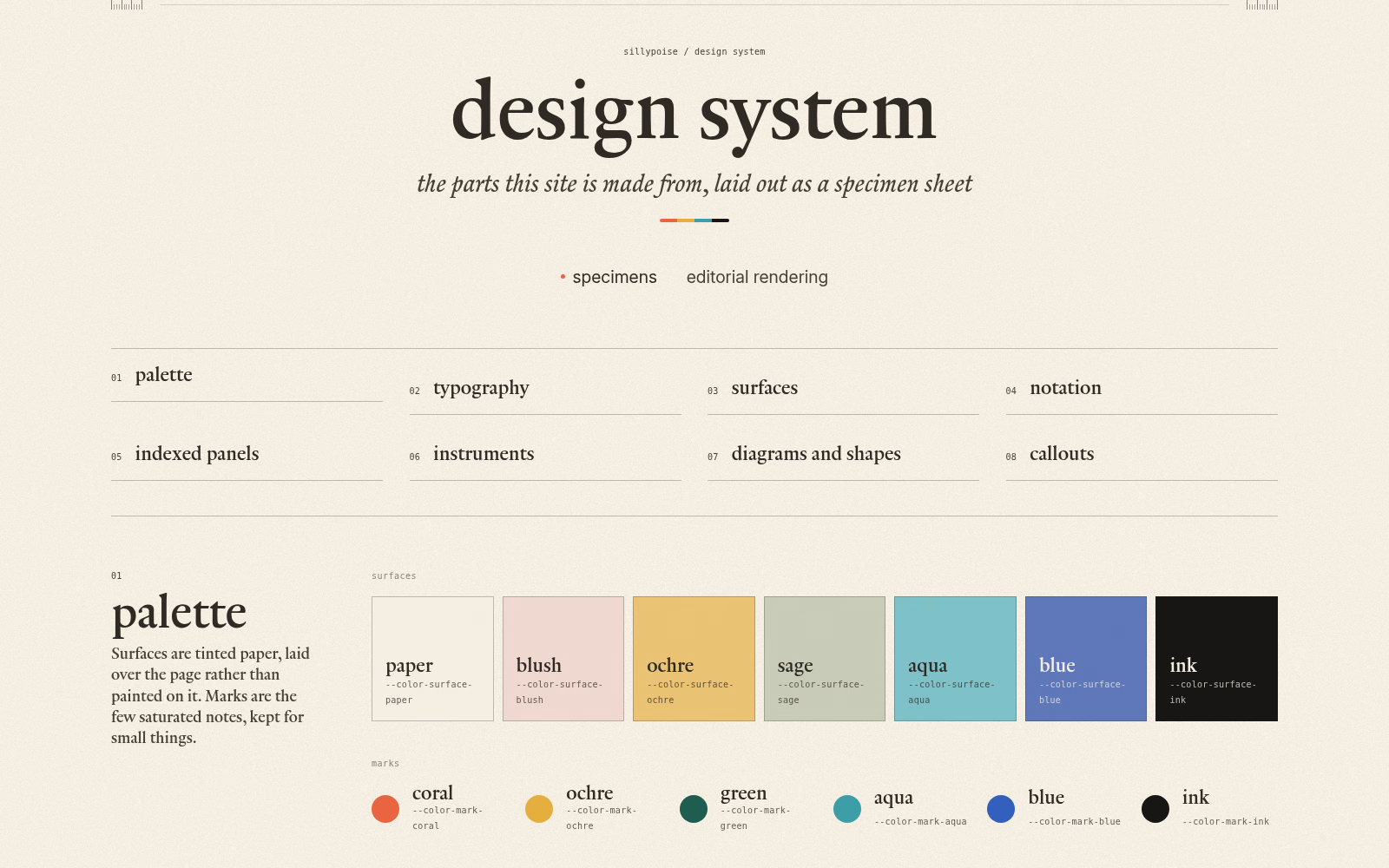
For this site I landed on an off-white paper grain background and a design system, because why not, that would allow me to build up the design of the site through re-usable components. I knew I wanted to combine the idea of old paper cartography with retro-tech and immediately knew those two can have very different opposing looks. I enjoy living in-between contradictions. The solution is to lean more into one of the ideas, in this case paper won out.
The design system is live and you can visit it here.
Prose the web
I don't particularly enjoy the clean look of things that seems to dominate the mainstream UI design aesthetics. Mind you, I enjoy it in apps, but even then it has started to feel far too sterile. So I did not want to go into a all sans direction with my blog. Instead, I imagined it as a place where it is, ideally, a pleasure to read. That means serif fonts, centered content and clean background.
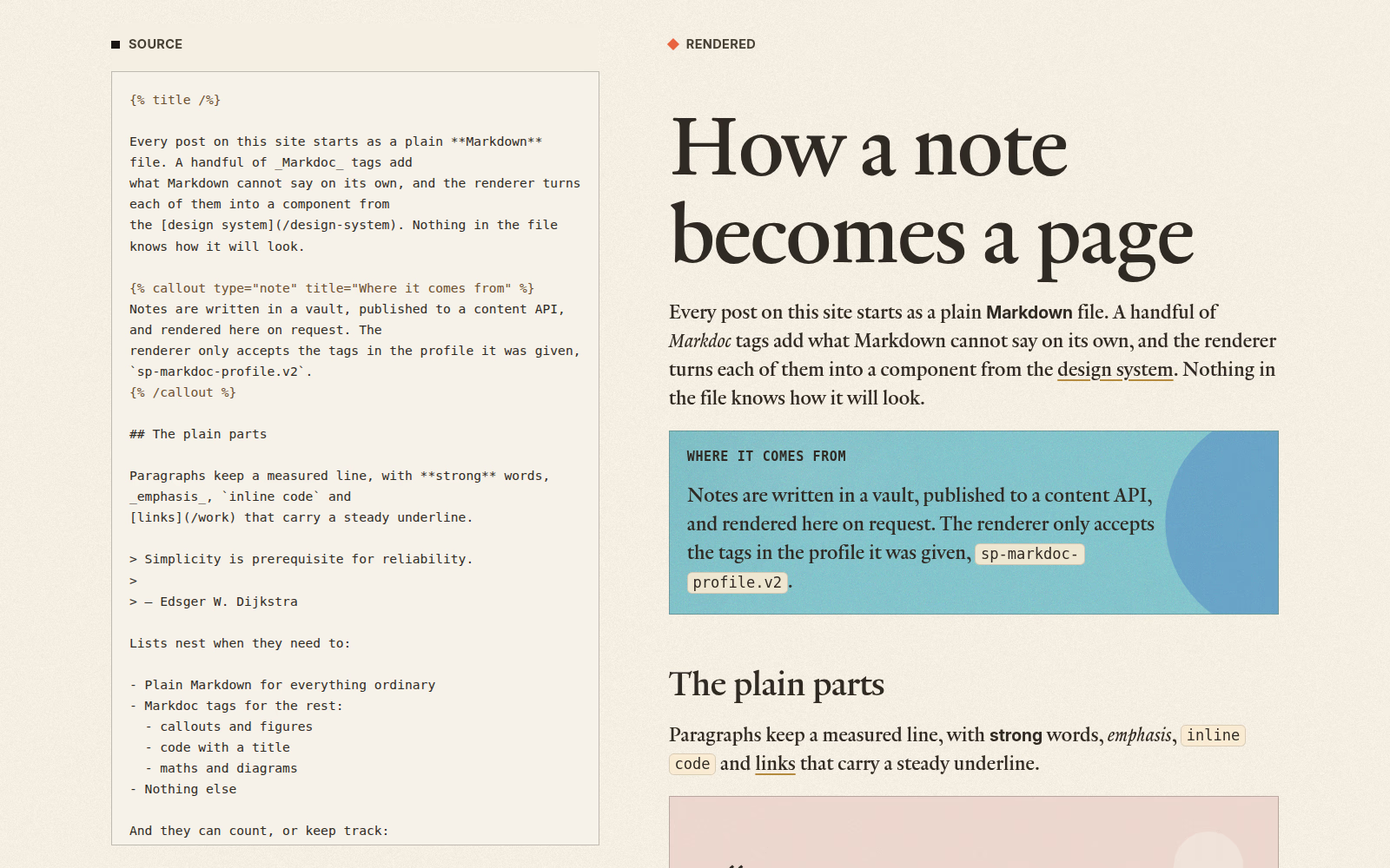
I am using Markdoc as my Markdown authoring framework. It simply takes my custom markdown, parses it and transforms it into react nodes. This allowed me to keep authoring simple in markdown as well as offering support for any custom component I'd like to add.
For example mermaid diagrams:
flowchart LR
Vault[Notes vault] --> API[Content API]
API --> Site[This site]
Media[Saga Media] --> Site
The editorial rendering page showcases how one note written in markdown renders.
A shy museum
I mentioned one of the main reasons I wanted to re-design my site was to share more of myself. I am not particularly good at this and it's always a challenge to share things even knowing 99% of the world doesn't care.
Regardless, as this beautiful vlog by John Green puts it:
Make your art and share it.
As imperfect as things are we must share them, this is truer than ever today but it has never not been true in the past nor will it not be in the future.
I did create a work section, which showcases different types of things I've made. Yeah, I am a professional software engineer but I am so much more and beyond that. Optimizing my personal corner of the internet for just showcasing myself as one narrow slice of a human is probably the algorithmic move but it is not what I wish to do.
I'll keep iterating and adding to this site, in different ways. I'll try making it as human as possible, yes AI helps but only where I'd like it to.
As the footer says this was built slowly, with care. That shall remain the plan onwards.